Want to understand local news? Make a map
By SAHAR FATIMA
Critics have suggested that scholars seeking to advance journalism studies must adopt a more multidisciplinary approach to research, one that looks beyond the strict confines of sociology, history, language studies, political science or cultural analysis. In this article, April Lindgren and Christina Wong argue that the geography of news coverage is a valuable starting point for scholars who wish to understand what local news gets reported, why and how it gets reported, and the potential consequences of such news coverage.
By APRIL LINDGREN and CHRISTINA WONG
About the authors
April Lindgren (april.lindgren@ryerson.ca) is an associate professor at Ryerson University’s School of Journalism, 350 Victoria Street, Toronto, ON, M5B 2K3, Canada, and director of the Ryerson Journalism Research Centre. She is the principal investigator for the Local News Research Project.
Christina Wong (christina1.wong@ryerson.ca) is a student in the Geographic Analysis program at Ryerson University, 350 Victoria Street, Toronto, ON, M5B 2K3, Canada. Her interests are in geographic information systems, database management, and geospatial analysis.
Abstract
Critics have suggested that scholars seeking to advance journalism studies must adopt a more multidisciplinary approach to research, one that looks beyond the strict confines of sociology, history, language studies, political science, or cultural analysis. This paper argues that the geography of news coverage is a valuable starting point for scholars who wish to understand what local news gets reported, why and how it gets reported, and the potential consequences of such news coverage. The work of the Local News Research Project at Ryerson University is introduced to illustrate how maps that reveal the geospatial aspects of local news can foster multidisciplinary investigations that push researchers beyond the traditional silos of journalism scholarship.
This paper was first published in the proceedings of the 2012 annual conference of the Canadian Communication Association.
Introduction
In her book Taking Journalism Seriously, Barbie Zelizer observes that scholars have traditionally looked to sociology, history, language studies, political science, or cultural analysis to understand journalism. She suggests that this silo approach “has inadvertently stunted the development of journalism’s study, causing scholars to miss the full range of activities, beliefs, and practices that give it its name” (Zelizer, 2004, p. 205-206).
In this paper, we argue that geography and spatial analysis are valuable tools for scholars seeking to understand what local news gets reported, why and how it gets reported, and the potential consequences of such coverage. Explorations of news geography, we contend, also foster the sort of journalism scholarship that answers Zelizer’s calls for more “interdisciplinary sensitivity” and “a more vigorous integration of the various frames traditionally used to consider journalism” (Zelizer, 2004, p. 214). We offer these arguments at a time of a growing interest in the spatiality of news and its implications. Geographers are looking to media theory to account for spatial patterns of news coverage (Howe, 2009; Rodgers, 2007). Journalism researchers are investigating how online editions of newspapers, with their greater spatial reach, affect the geographic boundaries of traditional news coverage (Gasher, 2007; Gasher & Gabriele, 2004; Gasher & Klein, 2008; Wu, 2007). The spatial pattern of news reporting is being used as the starting point for research on the role of news coverage in developing a sense of place and belonging (Buchanan, 2009; Cheng, 2005; Lindgren, 2011). And scholars continue to investigate international news flows to identify and explain why some cities and countries merit news coverage while others are ignored (Gasher, 2007; Gasher & Gabriele, 2004; Gasher & Klein, 2008; Kariel & Rosenvall, 1981, 1990; Wu, 2000, 2007).
This paper reviews literature on the geography of news and the power of mapping and other forms of data visualization as tools that foster multidisciplinary research. We provide an outline of the methodology employed by Ryerson University’s Local News Research Project to explore the geographic patterns, amount, and determinants of local news coverage in mainstream newspapers, online local news sites and in ethnocultural publications, which have a role to play in facilitating the integration of newcomers. Examples of how news geography maps can be combined with other data are then presented to illustrate their utility for multidisciplinary research that advances journalism studies.
Geography, journalism and multidisciplinary research
The mapping of data has become a staple of day-to-day reporting and investigative journalism (Herzog, 2003; Vallance-Jones & McKie, 2009). The intricate link between news and place, however, means that mapping news coverage also offers significant opportunities for the scholarly investigation of journalism through a multidisciplinary lens.
In their study of the territory covered by the online news websites of three major newspapers, for instance, Gasher and Klein (2008) suggest that each newspaper’s conceptual space is determined by the readers it seeks to attract, advertisers who buy access to those readers, and news coverage. “Journalists enter the picture through their decisions about who comprises their audience and what that community considers newsworthy, whether that ‘community’ occupies a neighbourhood, a city, or a nation” (p. 194).
The Local News Research Project has used news geography as the starting point for investigations of territorial stigmatization at the city level (Lindgren, 2009) and the sense of place conveyed by local news published in an ethnic newspaper (Lindgren, 2011). Studies of online news websites and more general examinations of international news flows (Wu, 2000) indicate that there are huge variations in the amount of news coverage accorded to different regions of the world. As Gasher (2007) has observed, the geographies of news “affirm existence and significance, signaling that some things, some people, some places are worthy of our notice, and others are not” (p. 301).
These and other efforts to make sense of the geography of news are often the starting point for multidisciplinary inquiry. Journalists’ decisions about the newsworthiness of different places have led to sociology’s investigation of newsroom values and practices and the various practical constraints on news gathering efforts. McQuail’s (2005) operational theory, which “refers to the practical ideas assembled and applied by media practitioners in the conduct of their own media work” (p. 15), describes this process in general terms. Others are more precise in positing that technology, deadline pressures, the availability of sources, business models, and other practical constraints influence what and where news is reported (Fishman, 1980; Gans, 1979; Kaniss, 1991; O’Neill & O’Connor, 2008; Schudson, 1989; Schultz, 2007; Tuchman, 1978).
While sociology can help explain why journalists cover certain types of news in certain locations, the next stop for scholars seeking to understand why these decisions matter could be cultural analysis and theories of the social construction of place. Reflecting on the newspaper in particular, Parisi and Holcomb (1994) observe that it is “a major instrument delivering a sense of the space beyond our senses. It evokes a world we inhabit largely through symbolic representation” (p. 377). Cresswell (1996, 2004, 2009) argues that perceptions of a place are shaped by the consumption of images, information, and ideas, all of which are the common currency of news media. Similarly, Tuan (1977) argues that undifferentiated space is translated into “place” as we get to know it better, either through direct experience or, in the case of news media, through conceptual or mediated symbols. To the extent that journalists and news organizations identify and define symbols, they shape citizens’ perceptions and understanding of places and social norms, as well as their sense of belonging and engagement (Anderson, 1991; Buchanan, 2009; Burgess, 1985; Cheng, 2005; Hartley, 1992; Lindgren, 2011; Massey, 1995; Matei & Ball-Rokeach, 2005; Relph, 1976; Shields, 1992). Journalists, in other words, construct reality with potential consequences for public policy and economic and social relations.
While geospatial data on news coverage have the potential to deepen our understanding of what reality is being constructed as well as its patterns and determinants, it is often necessary to add other data and information to the mix. Visual representation of both numerical data and non-numerical data offers a solution to this problem and, at the same time, expands the potential for multidisciplinary inquiry.
As Friendly (2008) notes, visual representation of quantitative information dates back centuries. One of the earliest examples of a visual representation of data is a 10th century chart of planetary movements. It is, however, the work of Dr. John Snow in 1855 that established data visualization as an indispensable research tool. Snow produced a map showing the addresses of people who had died of cholera in an afflicted London neighbourhood. The map revealed a cluster of cholera deaths adjacent to a single water pump. Using this information, he petitioned for the removal of the pump’s handle and successfully stopped the cholera outbreak.
Developments in data visualization since then have been fundamentally linked to technological advances and improvements in data collection and statistical theory. As Card, Mackinlay, and Shneiderman (1999) illustrate in their now classic Readings in Information Visualization, the evolution of computers has made it easier to create graphical representations that are useful for the communication of ideas. At the same time, the ability to link diverse sets of data and to translate them into images has given investigators “rapid statistical insight into data” (p. 7) that can also lead to the generationof new ideas. Data visualization aids cognitive ability by translating data into images so researchers can observe and understand patterns and relationships within data that otherwise could not be easily detected (Tufte, 1983; Unwin, Chen & Hardle, 2008). Moreover, the translation of data into visual forms can lead researchers to new questions that they may not have initially considered (Thomas, 2007).
Geovisualization is a specialized form of data visualization that MacEachren and Kraak (2001) define as the “visual exploration, analysis, synthesis and presentation of geospatial data” (p.3) that references geographic locations. It involves linking nominal data to diverse forms of other numerical and geographic data to solve complex problems. As such, maps have evolved far beyond their traditional role as simple devices for presenting geographic information. They are now instruments that support information exploration, the construction of knowledge, and the thinking processes of users (MacEachren and Kraak, 2001). Journalism researchers are among the beneficiaries of this development.
Method
The Local News Research Project
The Local News Research Project was launched at the Ryerson University School of Journalism in 2008. The project investigates the role of local news in the Greater Toronto Area by examining the subject matter of local news content, geographic patterns of news coverage, and the amount of local news being reported.
The project’s growing database of coded local news items is used to create maps that illustrate the spatial patterns of local news coverage produced by different mainstream and ethnic news organizations. These maps enable users to analyze the types of stories, amount of news, and spatial patterns of coverage produced by local news organizations, and to combine these results with other data. The database currently includes information on local news coverage in the Toronto Star, the largest mainstream daily newspaper in Canada and a major source of Toronto-area news. Data for four ethnocultural newspapers (Ming Pao, Korea Times Daily, Canadian Punjabi Post, and Russian Express) that serve major ethnic communities in the Greater Toronto Area have also been assembled with a view to exploring the role they play in helping recent immigrants become familiar with their adopted communities. The local news that appears in these publications is particularly important to people who, upon arrival in the GTA, may not be completely comfortable reading English but who nonetheless need access to news and information to help with the integration process. Additionally, data has been assembled for the online local news website openfile.ca. It will be used to investigate, among other topics, how the local news published by a website that relies on community suggestions for stories compares to the news published by mainstream media.
Coding Procedure
News stories and photographs from the five newspapers and the online news website have been coded using the same methodology.
Research on content analysis suggests that a minimum of two constructed weeks (Monday from the first week, Tuesday from the second week, etc.) is adequate to produce reliable data that is representative of a full year (Riffe, Aust & Lacy, 1993). For all newspapers, constructed weeks were selected to ensure that there was no overrepresentation of any single day of the week or event. To guarantee a robust sample, three constructed weeks of data were assembled for the Korea Times Daily, Russian Express, Canadian Punjabi Post, and Toronto Star between January and September 2011. The availability of extra resources in 2008 allowed for data collection for four constructed weeks for Ming Pao and the Toronto Star. The coding sample for the Toronto website openfile.ca included all stories and photographs published between January and September of 2011. Coding of the full sample was possible because the site during that time period was adding only a few new stories each day.
The Local News Research Project collects data on the total number of local and non-local news stories and photographs produced by individual news outlets. For each local news item, coders also enter a variety of other information into the database, including its origin (staff versus wire service), location in the newspaper, length, mentions of different ethnic or racial groups, and the news subject. Table 1 illustrates the range of coded subject categories. Local articles and photographs are further classified into a more detailed subject category. For example, police/crime news items are further categorized as violent crime, white-collar crime, or traffic-related criminal offences in the detailed subject category.
| General Subject Categories Coded in the Database | ||
| PO | Police/crime/legal/courts/local public safety | |
| ED | Education | |
| HE | Health/health protection/medical | |
| TR | Transit/gridlock/sprawl/traffic | |
| SO | Social supports/affordable housing/poverty/social justice | |
| LU | Land use/urban design/development/redevelopment | |
| MU | Municipal politics/services/budget | |
| EW | Environment/weather | |
| FA | Fire/accident | |
| RI | Religious-cultural diversity/multiculturalism/immigration | |
| AE | Arts/entertainment/local attractions | |
| BU | Business | |
| SP | Sports | |
| NS | Local impact of national security/terrorism/foreign policy/foreign disasters/human rights/Canadian soldiers/casualties | |
| FP | Federal or provincial politics/initiatives – local angle | |
| OT | Other/pets/travel/human interest | |
Table 1. General Subject Categories
Every geographic reference in a news item is also identified and coded for mapping purposes. References to specific places in articles and photographs are added to the database so that, for example, the Roger’s Centre building in Toronto would be coded with a geographic reference for 1 Blue Jays Way, the sport centre’s address. Where a story quotes a person who is explicitly associated with a residence, business, or organization, that data is also collected. If Toronto Mayor Rob Ford is quoted, for instance, a geographic reference for Toronto city hall would be added to the database.
To ensure consistency among coders, all coders are trained and are then subject to a full intercoder reliability test based on the standards and guidelines outlined by Lombard, Snyder-Duch and Bracken (2002). Intercoder reliability for interval variables, such as the number of local articles and photographs, is calculated using Lin’s Concordance. Intercoder reliability for nominal variables, such as the subject category for each news item, is measured using Cohen’s Kappa, a relatively conservative index. In both cases, reliability for variables is considered acceptable at or above .700 where two coders are involved. A full list of the intercoder reliability test results can be obtained from the authors.
Mapping Process
After geographic references are entered into the database, GeoPinpoint software is used to geocode the addresses. This process attaches coordinates to each address, allowing each geographic reference to be represented by a point on a map.
ArcGIS, the software used to create maps for the Local News Research Project, is a geographic information system that stores and retrieves data, provides mapping tools, and assists users in presenting and analyzing geographic data. The program is used to create all of the project’s local news coverage maps. ArcGIS displays points on a map for each specific geographic reference and uses polygons to represent areas such as neighbourhoods, parks or municipalities.
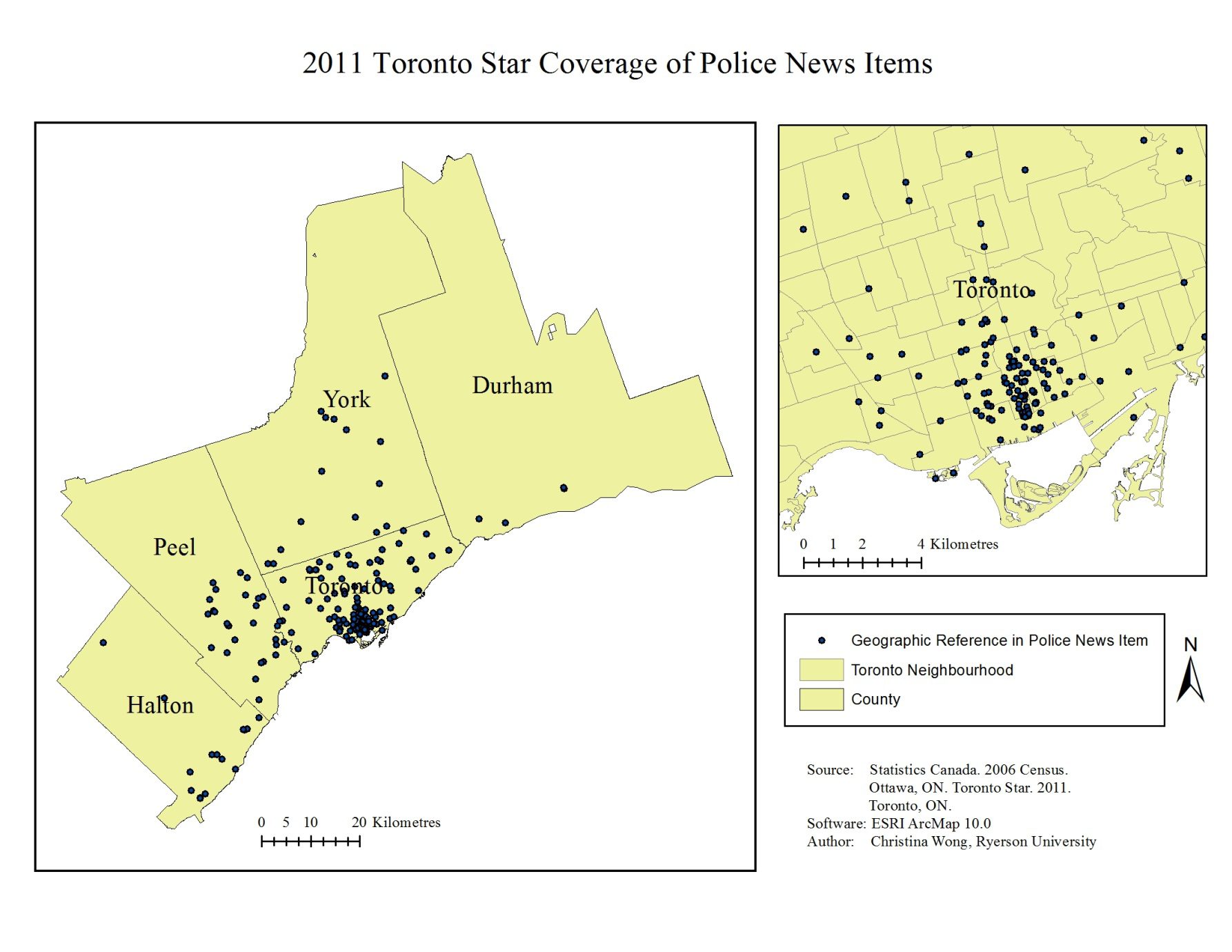
Data can be used to create maps showing all spatial references in all local news items. It can also be filtered using ArcGIS to create maps for specific variables. For example, a map can be created to display only Toronto Star news items from the Crime subject category as illustrated in Figure 1.
Figure 1. Toronto Star crime coverage
Additional details about the coding instruments, instructions, software, procedures, and mapping programs used for the Local News Research Project are available from the authors.
Mapping as a tool for understanding journalism
Maps are powerful tools for translating data into visual representations that can be easily understood and shared. They allow users to view data in new ways, display spatial patterns that would be difficult to recognize among data without the aid of visual representation, and can help researchers identify new research questions. Current mapping software, such as ArcGIS, promotes multidisciplinary research by making it easy to overlay, combine, and manipulate multiple sets of data. Two variables that were initially thought to be unrelated may show a relationship when presented spatially on the same map. Similarly, variables that were thought to be closely related or dependent upon one another may show only a weak relationship when compared on the same map.
The geography of news and its links to other disciplines
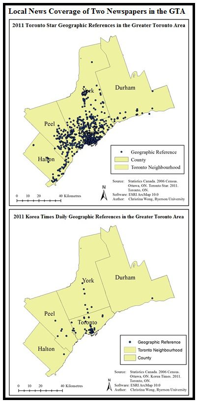
Basic maps showing the geography of news coverage are often the starting point for research questions that take researchers into multidisciplinary territory. For instance, the maps shown in Figure 2 reveal the spatial patterns of local news coverage for the Toronto Star and the Korea Times Daily. In both cases, the maps show a preponderance of news reporting in the city’s downtown area. Investigators might look to political science and theories of political engagement to explore the potential consequences of this downtown myopia on political participation in the broader community, particularly in the areas that are more or less ignored by news coverage. Do voting patterns correlate in any way with the amount of news coverage available?
Figure 2. Geography of news comparison of two GTA newspapers
News geography and journalists’ sources
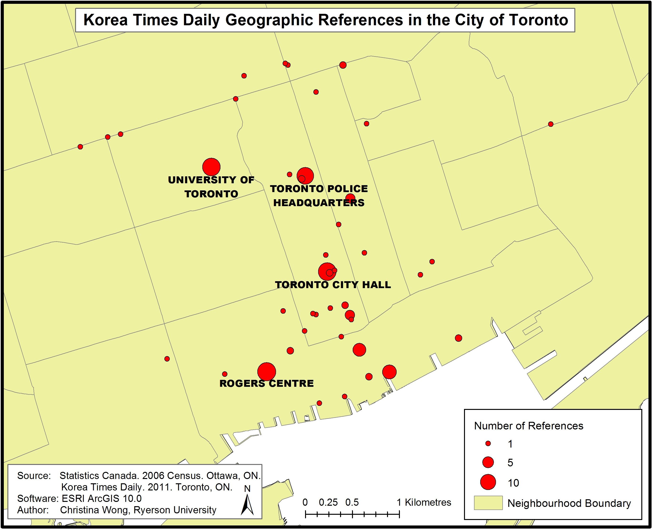
At the same time, sociological research on who journalists interview and where journalists go for stories and information could help researchers understand the emphasis that both newspapers seem to place on news in Toronto’s downtown core. Is it possible that The Star and Korea Times Daily, in this era of financially challenged newsrooms, both rely too heavily on easy-to-access elite sources at the many major institutions based in the city centre? Other maps generated by the project’s database can help answer this sort of question by illustrating the number of times a place is mentioned in a newspaper. Figure 3, for instance, shows that the most common sources of news for reporters at the Korea Times Daily are Toronto city hall, police headquarters, the University of Toronto, and the Rogers Centre professional sports venue. It is worth noting that all of these institutions or the organizations they house have sophisticated, formal public relations departments that make it relatively easy for reporters to get the information they need.
Figure 3. Korea Times Daily news coverage
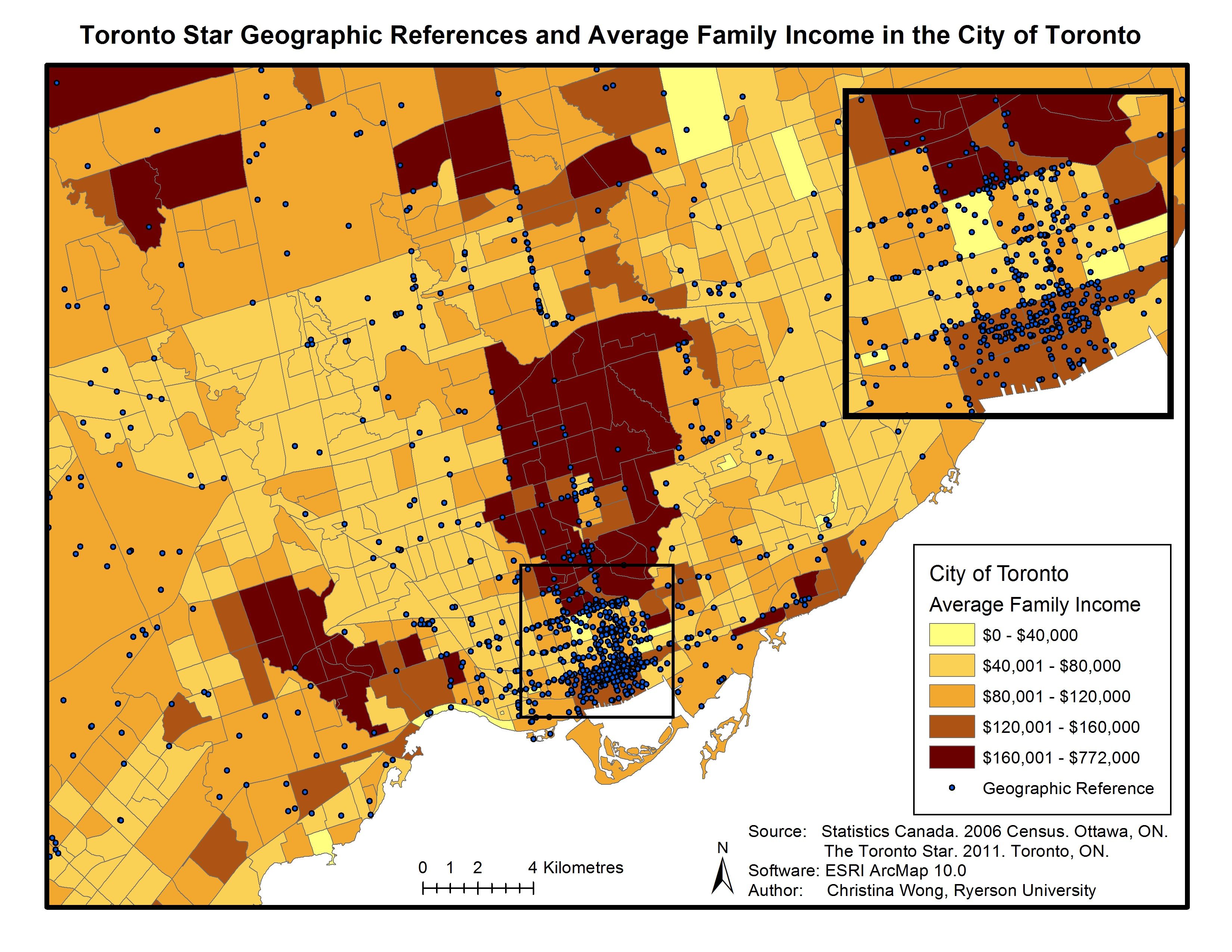
A growing variety of spatially defined data is becoming available to journalism researchers for incorporation into news geography maps. All levels of the Canadian government release geographic information relating to their jurisdictions and a great deal of data is now available by request from private businesses and organizations. For scholars and for the growing number of journalists conducting computer-assisted reporting, the most widely used data for analysis comes from the Census of Canada, which provides data about population demographics, dwellings, languages, immigration, minority groups, education, labour and occupation, and income. These data are available at various geographic levels, including census metropolitan areas and census tracts. Census data, for instance, can be used to explore patterns of news coverage in relation to income as illustrated in Figure 4, which combines Toronto Star news coverage with average family income by census tract.
Figure 4. Toronto Star coverage and average family income
As the inset in Figure 4 illustrates, initial visual inspections of news coverage suggest there appears to be a cluster of coverage in more affluent parts of the city’s downtown core in particular. A researcher seeking to investigate this issue in more depth could analyze the amount and type of news reported for census tracts with high, medium and low income levels, and look to a range of disciplines to explain the results, including sociological research on journalists’ values, theories of political economy and engagement, and business considerations. If there is a news focus on more affluent areas, might that be a reflection of journalists’ own values and social class? Whose voices are being heard in the news and how might this affect political discourse and the political agenda? Is there a link between the amount of news coverage of more affluent areas and advertisers’ desire to reach those audiences?
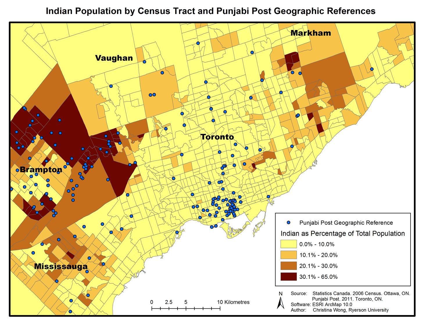
Figure 5, which shows the Canadian Punjabi Post’s news coverage combined with the proportion of the population of Indian ethnicity at the census tract level, further illustrates how data sets can be combined to generate research questions. Viewed through a cultural studies lens, a researcher might ask about the sense of place the paper conveys in its coverage of the Brampton area, which is home to many residents of Indian origin. This, in turn, complements sociological research that has established a link between the amount of local news available in ethnic media and the extent to which ethnic communities are integrated into broader society (Lin and Song, 2006).
Figure 5. Punjabi Post coverage and census population date
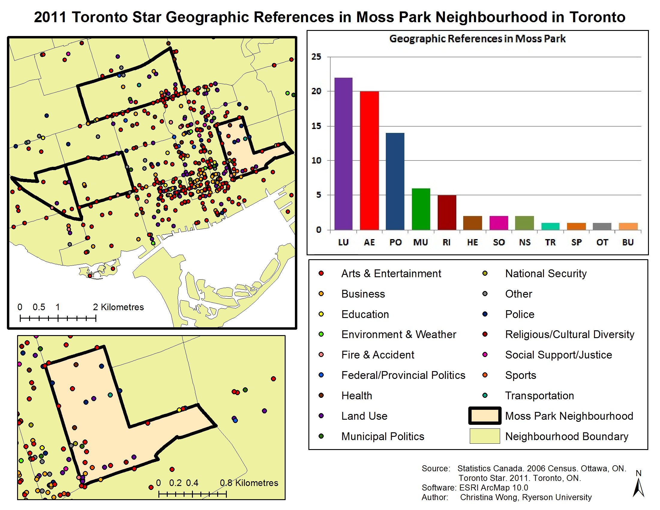
Maps also allow for the study of journalism at different geographic levels. The Local News Research Project has completed various detailed analyses of news coverage by neighbourhood. For instance, an analysis of the Toronto Star’s 2011 news coverage of the Moss Park neighbourhood showed that stories and photographs about the area focused on land use, arts and entertainment, and police stories (Figure 6). Moss Park is a neighbourhood that has experienced rapid gentrification over the past decade: the proportion of the neighbourhood earning more than $100,000 per year increased to 33.7 percent from 13.9 percent between 2001 and 2006 (City of Toronto, 2008). With the shift in neighbourhood demographics, what was once a predominantly low-income area has become the site of considerable condominium development, a change that clearly has attracted the attention of journalists.
For journalism scholars familiar with the urban studies literature on the nature and impact of gentrification, this raises some potentially interesting issues including whether the news coverage promotes the interests of the gentrifying class at the expense of lower-income residents. Neighbourhood maps of this sort are also of practical use to local groups and agencies concerned with the representation of their community in the news.
Figure 6. Toronto Star coverage of Moss Park
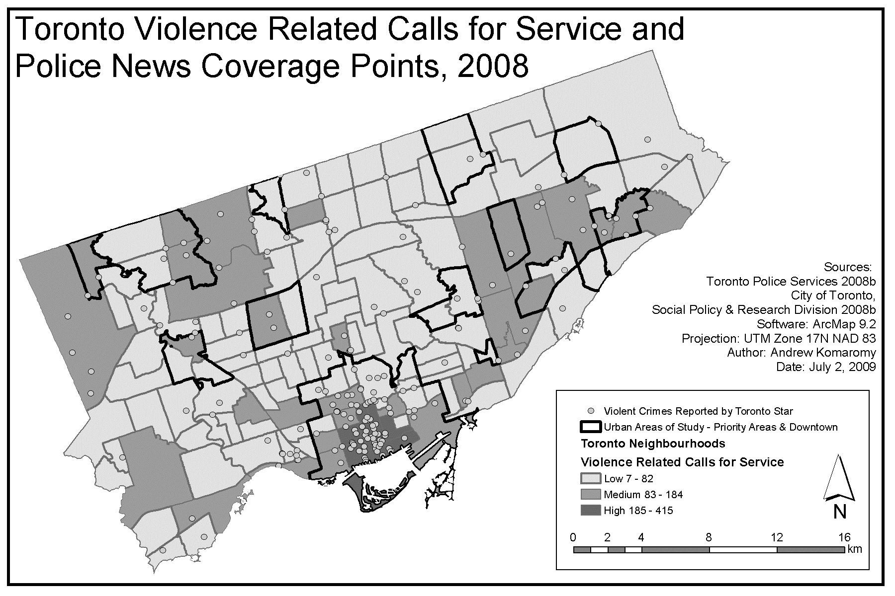
The use of news mapping to explore characterizations of neighbourhoods was explored more extensively in a study of Toronto’s disadvantaged areas conducted by The Local News Research Project. Mapping of the Toronto Star’s coverage of the 13 areas that city officials and social agencies identified as beset by socioeconomic problems and lacking in services found that the communities received little attention in the newspaper. In the news coverage that was published, crime and police-related stories and photographs were the most common subjects (Lindgren, 2009). Yet subsequent mapping that combined police and crime coverage with calls to the police for service related to violent incidents (a crime indicator) found little correlation between the two data sets (Figure 7). For this analysis, City of Toronto neighbourhoods were divided into three categories based on the number of violence-related calls for service originating from each neighbourhood during the study period. These categories, illustrated in Figure 7, showed that the neighbourhoods with the highest number of calls for service were located in the downtown core, while the 13 identified priority neighbourhoods were in the low and medium calls-for-service categories. Despite this, crime coverage was the number one subject of all news coverage for those areas. In the downtown area, meanwhile, where calls to police arising from violent incidents were the most frequent during the study period, arts, entertainment and sports dominated the news agenda. The study looked to newsgathering practices and concluded that crime dominates coverage of the priority-area neighbourhoods because little effort goes into covering other sorts of stories. This is due partly to how cheap and easy it is to gather crime news – a quick look at the latest press releases on the website of the Toronto Police Service website can generate multiple stories. But it also has to do with the dearth of on-the-ground reporters based in the city’s troubled neighbourhoods, where they can tap into events and issues and tell stories beyond the crime beat.
The research, which began with a map, drew upon a variety of disciplines to explain the amount, nature, and potential effects of news coverage for the disadvantaged areas. The multidisciplinary panorama included sociology (news reporting practices and newsroom organization), criminology (patterns of crime), and cultural studies (geographic stigmatization). The paper also identified areas for further research including questions about the extent to which journalists’ own negative perceptions of neighbourhoods led them to reinforce stereotypes, the role of the media in defining the reputation of disadvantaged areas, and the role of police information units in promoting extensive crime coverage.
Figure 7. Crime rates and priority neighbourhoods
Another example of the role of maps in fostering a multidisciplinary approach to journalism research is evident in a Local News Research Project study of how the Greater Toronto Area is portrayed to readers of the Chinese-language newspaper Ming Pao (Lindgren, 2011). The content analysis revealed that news from China dominated the paper’s coverage (52 percent) while local news about the Greater Toronto Area accounted for only 8 percent of all content. The local news that did appear in the newspaper included significant amounts of reporting on festivals, celebrations, and community projects in areas of the GTA that are home to large concentrations of residents of Chinese origin. Crime reporting, however, was the top news subject overall and mapping analysis showed that it was reported on throughout the whole Greater Toronto Area and not just confined to incidents that took place in the Chinese enclaves or incidents involving people of Chinese origin. News about murder, mayhem, fires, accidents and injury accounted for one in every five local news items published in the newspaper. This emphasis on crime reporting raised concerns about the message conveyed to readers about personal safety and security in a metropolitan area where crime rates have been in steady decline.
Explaining the amount, extent, and nature of news coverage of the disadvantaged areas required a multidisciplinary approach. In addition to drawing upon criminology research on the role of news media in shaping readers’ perceptions of crime and safety, the study also looked to cultural geography for a discussion of the sense of place conveyed by the newspaper. Political science research informed the related discussion about the role of news and information in fostering civic engagement and a sense of belonging among newcomers.
Conclusion
Approaching the study of journalism through a geography lens is challenging in that extracting good geographic data from local news coverage can be time consuming and expensive. At the same time, however, mapping software is becoming more and more user-friendly, adaptable and, therefore, useful to scholars. The growing availability of geospatial data represents a great opportunity for journalism researchers in that it allows them to combine income, ethnicity, language ability, crime rate indicators, public services, political jurisdictions and dozens of other data sets with news geography maps that illustrate patterns of local coverage. Incorporating the spatial element enables researchers to see data in different ways, discover associations, and cultivate new research questions.
This paper outlines some of the practical applications of news mapping techniques to illustrate their potential as research tools that foster multidisciplinary scholarship in journalism research. The Local News Research Project has investigated, among other topics, news coverage of disadvantaged Toronto neighbourhoods and portrayals of the Greater Toronto Area in ethnic newspapers. Maps were the starting point for these studies. In some instances, the maps suggested the research question. In other instances, a research question was identified in advance and maps were used to pursue the answer. In all cases, the maps led to the sort of multidisciplinary scholarly explorations that Zelizer (2004) calls for in her book.
Acknowledgements
This research was generously supported by CERIS – The Ontario Metropolis Centre, the Social Sciences & Humanities Research Council (SSHRC), and Ryerson University. I would like to thank my research assistant and co-author Christina Wong for her work on data analysis and mapping as well as coders Emily Jin, Harbir Natt, Sue Chun and Maria Siassina for their care, diligence, and enthusiasm as members of the Local News Research Project team.
References
Anderson, Benedict. (1991). Imagined communities: Reflections on the origin and spread of nationalism. Revised and extended edition. London: Verso.
Buchanan, Carrie. (2009). The sense of place in the daily newspaper. Aether: The Journal of Media Geography, 4, 62-84.
Burgess, Jacquelin A. (1985). News from nowhere: The press, the riots and the myth of the inner city. In J. A. Burgess & J. R. Gold (Eds.), Geography, the Media & Popular Culture (pp. 192-228). London: Croom Helm.
Card, Stuart K., Mackinlay, Jock D., & Shneiderman, Ben. (1999). Information visualization: Using vision to think. San Francisco: Morgan Kaufmann.
Cheng, Hau Ling. (2005). Constructing a transnational, multilocal sense of belonging: An analysis of Ming Pao. Journal of Communication Inquiry, 29(2), 141-159.
City of Toronto. (2008). Moss Park (73): Social Profile #4 – Neighbourhoods Income & Poverty. Retrieved September 6, 2012, from http://www.toronto.ca/demographics/neighbourhoods.htm
Cresswell, Tim. (1996). In Place/Out of Place: Geography, ideology, and transgression. Minneapolis: University of Minnesota Press.
———. (2004). Place: A short introduction. Oxford: Blackwell.
———. (2009). Place. Oxford: Elsevier. Retrieved June 17, 2010, from www.elsevierdirect.com/brochures/hugy/SampleContent/Place.pdf
Fishman, Mark. (1980). Manufacturing the news. Austin: University of Texas Press.
Friendly, Michael. (2008). A history of data visualization. In C. Chen, W. Hardle & A. Unwin (Eds.), Handbook of Data Visualization (pp. 15-56). Heidelberg: Springer.
Gans, Herbert J. (1979). Deciding what’s news: A study of CBS evening news, NBC Nightly News, Newsweek, and Time. New York: Pantheon Books.
Gasher, Mike. (2007). The view from here: A news-flow study of the on-line editions of Canada’s national newspapers. Journalism Studies, 8(2), 299-319.
Gasher, Mike & Gabriele, Sandra. (2004). Increasing circulation? A comparative news-flow study of the Montreal Gazette’s hard-copy and on-line editions. Journalism Studies, 5(3), 311-323.
Gasher, Mike & Klein, Reisa. (2008). Mapping the geography of on-line news. Canadian Journal of Communication, 33, 193-211.
Hartley, John. (1992). The politics of pictures: The creation of the public in the age of popular media. London & New York: Routledge.
Herzog, David. (2003). Mapping the news: Case studies in GIS and journalism. Redlands: ESRI Press.
Howe, Peter. (2009). Newsworthy spaces: the semantic geographies of local news. Aether: The Journal of Media Geography, 4, 43-61. Available from http://geogdata.csun.edu/~aether/volume_04.html
Kaniss, Phyllis. (1991). Making local news. Chicago: University of Chicago Press.
Kariel, Herbert G. & Rosenvall, Lynn A. (1981). Analyzing news origin profile of Canadian daily newspapers. Journalism Quarterly, 58, 254-259.
Kariel. Herbert G. & Rosenvall, Lynn A. (1990). Factors influencing international news flow. In L.J. Martin & R.E. Hiebert (Eds.), Current Issues in International Communication (pp. 18-26). White Plains, N.Y.: Longman.
Lin, Wan-Ying & Song, Hayeon. (2006). Geo-ethnic storytelling. Journalism 7(3): 362-388.
Lindgren, April. (2009). News, geography and disadvantage: Mapping newspaper coverage of high-needs neighourhoods in Toronto, Canada. Canadian Journal of Urban Research, 18(1), 74-97.
Lindgren, April. (2011). Interpreting the city: Portrayals of place in a Toronto-area ethnic newspaper. Aether: The Journal of Media Geography 8A, 68-88.
Lombard, Matthew, Snyder-Duch, Jennifer, & Bracken, Cheryl C. (2002). Content analysis in mass communication: Assessment and reporting of intercoder reliability. Human Communication Research, 28, 587-604.
MacEachren, Alan M. & Kraak, Menno-Jan. (2001). Research challenges in geovisualization. Cartography and Geographic Information Science, 28(1), 3-12.
Massey, Doreen. (1995). The conceptualization of place. In D. Massey & P. Jess (Eds.), A place in the world? Places, cultures and globalization (pp. 45-85). Oxford: Oxford University Press.
Matei, Sorin A., & Ball-Rokeach, Sandra. (2005). Watts, the 1965 Los Angeles riots, and the communicative construction of the fear epicenter of Los Angeles. Communication Monographs, 72(3), 301-323.
McQuail, Denis. (2005). Mass Community Theory. London: Sage.
O’Neill, Deirdre, & O’Connor, Catherine. (2008). The passive journalist. Journalism Practice, 2(3), 487-500.
Parisi, Peter, & Holcomb, Brlavel. (1994). Symbolizing place: Journalistic narratives of the city. Urban Geography, 15(4), 376-394.
Relph, Edward. (1976). Place and Placelessness. London: Pion.
Riffe, Daniel, Aust, Charles F. & Lacy, Stephen R. (1993). The effectiveness of random, consecutive day and constructed week sampling. Journalism Quarterly, 70, 133-139.
Rodgers, Scott J. (2007). New geographies of the metropolitan newspaper: Exploring spaces of urban political journalism at the Toronto Star. (Unpublished doctoral thesis). King’s College, University of London.
Schudson, Michael. (1989). The sociology of news production. Media, Culture and Society, 11, 263-282.
Schultz, Ida. (2007). The journalistic gut feeling: Journalistic doxa, news habitus and orthodox news values. Journalism Practice, 1(2), 190-207.
Shields, Rob. (1992). Places on the Margin: Alternative geographies of modernity. London: Routledge.
Thomas, James J. (2007). Visual analytics: why now? Information visualization, 6, 104-106.
Tuan, Yi-Fu. (1977). Space and Place: The perspective of experience. Minneapolis: University of Minnesota Press.
Tuchman, Gaye. (1978). Making news: A study in the construction of reality. New York: Free Press.
Tufte, Edward R. (1983). The visual display of quantitative information. Cheshire, CT.: Graphics Press.
Unwin, Antony, Chen, Chun-Houh & Hardle, Wolfgang. (2008). Introduction, In C. Chen, W. Hardle & A.Unwin, (Eds.), Handbook of Data Visualization (pp. 3-14). Heidelberg: Springer.
Vallance-Jones, Fred & McKie, David. (2009). Computer-assisted reporting: A comprehensive primer. Don Mills: Oxford.
Wu, H. D. (2000). Systemic determinants of international news coverage: A comparison of 38 countries. Journal of Communication, 50(2), 110-130.
Wu, H. D. (2007). A brave new world for international news? International Communication Gazette, 69, 539-551.
Zelizer, Barbie. (2004). Taking Journalism Seriously. Sage: Thousands Oak, CA.

